


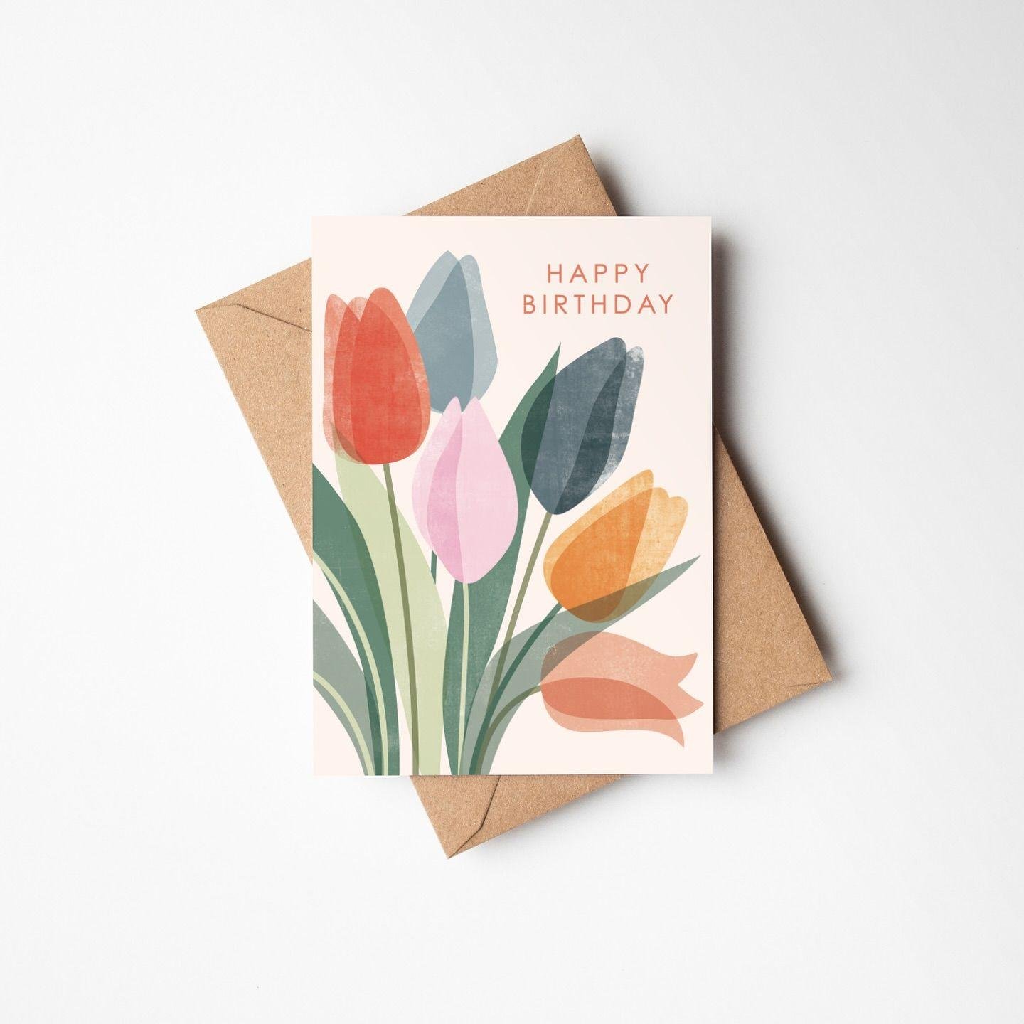
A greeting card competes for attention the moment it arrives. It sits among other mail, other cards, and other messages. The ones that stand out do so because of deliberate design decisions. Every visual element either contributes to or detracts from that first impression. Understanding which design elements create standout cards helps you make better creative choices. Whether designing for personal use or professional distribution, these principles apply universally.
The Visual Hierarchy That Commands Attention
Visual hierarchy is the foundational principle of effective card design. It determines the order in which a viewer processes each design element. A card without clear hierarchy creates visual confusion and a forgettable impression. A card with strong hierarchy guides the eye naturally from focal point to supporting elements. The most important element should command the most visual weight on the card. Everything else should support and frame that focal point without competing for dominance.
Focal Points and Their Emotional Function
Every standout card has a single dominant focal point anchoring the composition. This focal point carries the card's primary emotional message to the viewer immediately. A bold typographic statement creates a different focal energy than a detailed illustration. An oversized photograph communicates differently than a delicate botanical illustration does. The choice of focal point type should align with the emotional tone of the occasion. A focal point that mismatches the emotional context creates a jarring disconnect for the recipient.
Supporting Elements and Visual Balance
Supporting design elements surround and complement the focal point without overpowering it. Decorative borders, texture fields, and typographic secondary elements serve this supporting role. Balance between the focal point and supporting elements is critical to visual harmony. A balanced composition feels settled, complete, and genuinely pleasurable to look at. An unbalanced composition creates subconscious visual discomfort that recipients may not consciously articulate. Balance does not mean symmetry, as asymmetric balance often creates more dynamic compositions.
Color as the Primary Emotional Communicator
Color communicates emotion faster than any other single design element available. It is processed by the brain before typography, imagery, or layout is evaluated. The colors you choose for a greeting card immediately establish the emotional register. Warm tones like reds, oranges, and golds communicate energy, love, and celebratory warmth. Cool tones like blues, greens, and purples communicate calm, sincerity, and reflective depth. Neutral tones like creams, grays, and taupes communicate sophistication, restraint, and timeless elegance.
Building a Color Palette That Serves the Occasion
Effective color palettes for greeting cards are built around the occasion's emotional needs. A birthday palette should communicate joy, vitality, and celebratory energy to the recipient. A sympathy palette should communicate calm, gentleness, and quiet comforting warmth throughout. A wedding palette should communicate romance, elegance, and the solemn gravity of commitment. Limiting your palette to two or three colors creates stronger visual coherence overall. Too many colors create a chaotic visual environment that undermines the emotional message entirely. A focused, occasion-appropriate palette communicates emotional intelligence through intentional design choices.
The Impact of Color Contrast on Card Visibility
Color contrast determines how visible and readable each card element truly is. High contrast between background and foreground elements creates visual clarity and immediacy. Low contrast creates a soft, unified aesthetic suited to subtle, intimate emotional messages. The contrast between your card and its envelope also contributes to the overall impression. A vibrant card emerging from a neutral envelope creates a pleasing moment of discovery. Contrast decisions should be made holistically across the entire card experience.
Typography That Carries Emotional Weight
Typography is the bridge between visual design and written communication on cards. The fonts on a greeting card carry emotional weight before a single word is processed. A flowing cursive script communicates romance, personal warmth, and feminine elegance well. A bold, clean serif communicates tradition, authority, and distinguished personal character. A playful handwritten font communicates informality, creativity, and personal investment in the message. Choosing fonts that align with the card's emotional purpose creates a seamless experience.
Font Pairing Principles for Greeting Cards
Effective font pairing creates visual interest while maintaining readability and coherence. The most reliable pairing principle combines one expressive font with one restrained font. A decorative headline font paired with a clean body font creates dynamic hierarchy. The headline font carries personality while the body font ensures comfortable readability. Avoid pairing two highly decorative fonts, as they compete and create visual noise. The contrast between paired fonts should feel intentional rather than accidental or arbitrary.
Sizing, Spacing, and Typographic Rhythm
Size relationships between typographic elements create rhythm and guide comprehension naturally. The primary message, a name, a greeting, or a key phrase, should be the largest element. Supporting text, dates, and secondary messages should be proportionally and clearly smaller. Line spacing should be generous enough to allow comfortable reading without visual fatigue. Letter spacing adjustments can add elegance to headlines and improve readability at small sizes. Typographic rhythm created through consistent size relationships produces a polished, professional card result.
Imagery and Illustration Styles That Create Distinction
The imagery style chosen for a greeting card defines its entire aesthetic personality. Different illustration and photographic approaches communicate entirely different values and feelings. Hand-drawn illustration communicates artisan quality, personal investment, and creative authenticity to recipients. Photographic imagery creates emotional realism and a documentary personal connection. Abstract graphic imagery communicates contemporary design sensibility and creative confidence clearly. The right imagery style is the one that best serves the card's specific emotional purpose.
Current Illustration Trends Worth Exploring
Contemporary greeting card illustration trends offer rich creative territory worth exploring. Botanical illustration has experienced a powerful resurgence across many design categories. Loose, expressive watercolor creates a fresh, artistic quality that feels beautifully timeless. Geometric abstraction in soft palettes communicates modern sophistication with visual warmth. Character-based illustration adds narrative personality well-suited to humor and lighthearted occasions. Exploring these trends while maintaining personal or brand relevance produces distinctive, contemporary card results.
At this stage in the design process, the right production partner determines whether your vision is realized fully. Working with professionals who offer custom greeting cards printing gives you access to specialty papers, die-cutting, and premium finishes. These production capabilities transform excellent design into an extraordinary physical experience. Professional printing precision ensures colors are accurate, edges are clean, and finishes are perfectly executed. The production quality itself becomes part of what makes the card truly stand out.
Paper and Finish Elements That Create Sensory Distinction
A card's physical properties are design elements as much as visual ones are. The paper stock creates a tactile impression the moment the card is touched by recipients. A heavy, premium cardstock communicates quality and intentionality before anything is read. A specialty textured paper creates sensory interest that flat, smooth alternatives simply cannot match. The finish applied to the card surface adds a final layer of memorable sensory distinction. These physical design elements create experiences that digital communication can never replicate.
Laminate Finishes and Their Design Impact
Different laminate finishes serve different aesthetic and emotional design purposes effectively. Soft-touch matte laminate creates a velvety surface that communicates luxury and restrained elegance. Gloss laminate produces rich, saturated colors with a polished, contemporary visual energy. Satin laminate strikes a middle ground between gloss and matte with a sophisticated sheen. Selective laminate application, applying gloss only to certain areas, creates compelling tactile contrast. The finish choice should align with the card's visual design language and emotional purpose.
Specialty Finishes That Elevate Design Distinction
Beyond laminate, specialty finishes add extraordinary visual and tactile distinction to cards. Foil stamping applies metallic brilliance to specific design elements for immediate visual impact. Embossing raises selected design elements into three-dimensional sculptural relief above the surface. Debossing creates the opposite effect, pressing elements below the surface for an elegant result. Spot UV coating creates selective gloss contrast against matte backgrounds for beautiful visual depth. Die-cutting allows the card's physical shape to become part of the design statement itself.
Layout Principles That Create Standout Compositions
Layout is the architecture within which all other design elements live and interact. A strong layout creates visual flow, balance, and a sense of purposeful design intention. The most memorable card layouts often make a single brave compositional decision clearly. Full-bleed imagery extending to every edge creates immersive and stunning visual impact. A dramatically oversized typographic element anchoring an otherwise minimal layout commands instant attention. Whatever the compositional approach, it should feel intentional and serve the card's emotional message fully.
Bringing All Elements Together Cohesively
A standout greeting card succeeds because all its elements work together toward one purpose. Color, typography, imagery, paper, finish, and layout should form a unified visual conversation. When every element serves the same emotional goal, the result feels effortlessly cohesive and resonant. When elements pull in different directions, the result feels confused and ultimately unmemorable. Reviewing your design with the question of whether every element serves the same purpose reveals refinement areas. A card that achieves full element cohesion stands out through their perfect collaborative design.

 English
 Arabic
 French
 Spanish
 Portuguese
 Deutsch
 Turkish
 Dutch
Dutch
 Italiano
 Russian
 Portuguese (Brazil)
 Greek
Greek